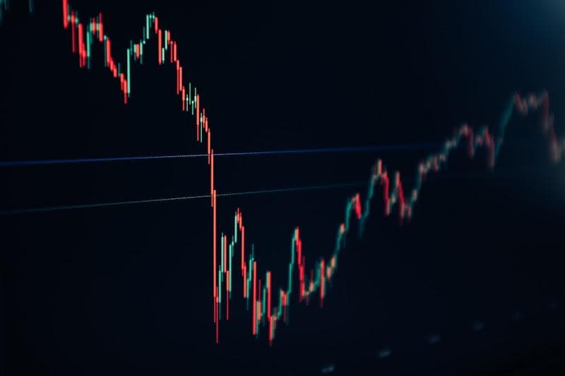
Humanity has been devising innovative methods to represent and analyze data for centuries. One such tool that has been widely employed and embraced for its simplicity and efficacy is the candlestick chart. Below, we delve into the intriguing history of this charting method, how it gets its unique name, and why it remains relevant even today.
Table of Contents
Origin of Candlestick Charts
The journey of the candlestick chart, oddly enough, begins in the 18th century with a Japanese rice trader named Munehisa Homma. Hailing from Sakata, Homma formulated a method to visualize the patterns in rice trading.
Homma, considered the first to use technical analysis, analyzed the psychological aspects of market participants. His primary trading method was later deemed Sakata’s Methods. Over time, these techniques, infused with various adaptations, culminated in the creation of the sophisticated and holistic charting system we now refer to as the candlestick chart.
It wasn’t until the 1980s that this charting method traveled across borders and was introduced to the Western world. An American trader named Steve Nison is often credited with this historical import. Following its inception, the candlestick chart quickly gained popularity among traders worldwide due to its ease of interpretation.
Understanding the history of the candlestick chart enables traders not only to comprehend its origins but also to ideally embody the founding principles laid by Homma.
The Rationale Behind the Candlestick Chart
Candlestick charts are known due to their unique design resembling a candlestick, with thick bodies and thin lines extending out from both ends, appearing as ‘wicks.’ This clever design is no mere aesthetic indulgence but a well-thought-out strategy, offering a wholesome view of market conditions.
The body of the candlestick represents the opening and closing prices during a specific period, while the wicks represent the highest and lowest prices during the same period. This simple and easy-to-read design efficiently provides four key pieces of information to the trader.
Furthermore, the color of the body illustrates the directional movement of the market. A white (or green) body indicates a bullish trend, meaning the closing price was higher than the opening price. On the contrary, a black (or red) body signifies a bearish trend, meaning the closing price was lower than the opening price.
This design’s ingenuity lies in its transparency and the wealth of information it offers at a glance. Therefore, it’s no surprise that it remains prominent and relevant in the fluctuating landscape of financial markets.
Understanding the Anatomy of a Candlestick Chart

To fully leverage the benefits of candlestick charts in your trading decisions, it’s crucial to understand their ‘anatomy.’ As discussed earlier, each candlestick is composed of a body that reflects the opening and closing prices and two wicks that represent the highest and lowest prices.
But there’s more to this chart than meets the eye. Experienced traders go beyond merely recognizing bullish and bearish candlesticks; they study patterns and their implications. Patterns can be divided into many types: simple, complex, bullish, bearish, and more. Each pattern indicates a specific market sentiment and helps predict future price movements.
Each pattern has its significance, and their understanding requires a keen eye and practiced expertise. Investing time to learn these patterns can prove incredibly rewarding, allowing traders to navigate the markets more efficiently and make well-informed decisions.
While candlestick charts’ complexity may appear daunting to novice traders, understanding their structure can unlock the door to accurate predictions and profitable trading. It’s a journey of continuous learning, curiosity, and adaptation.
